


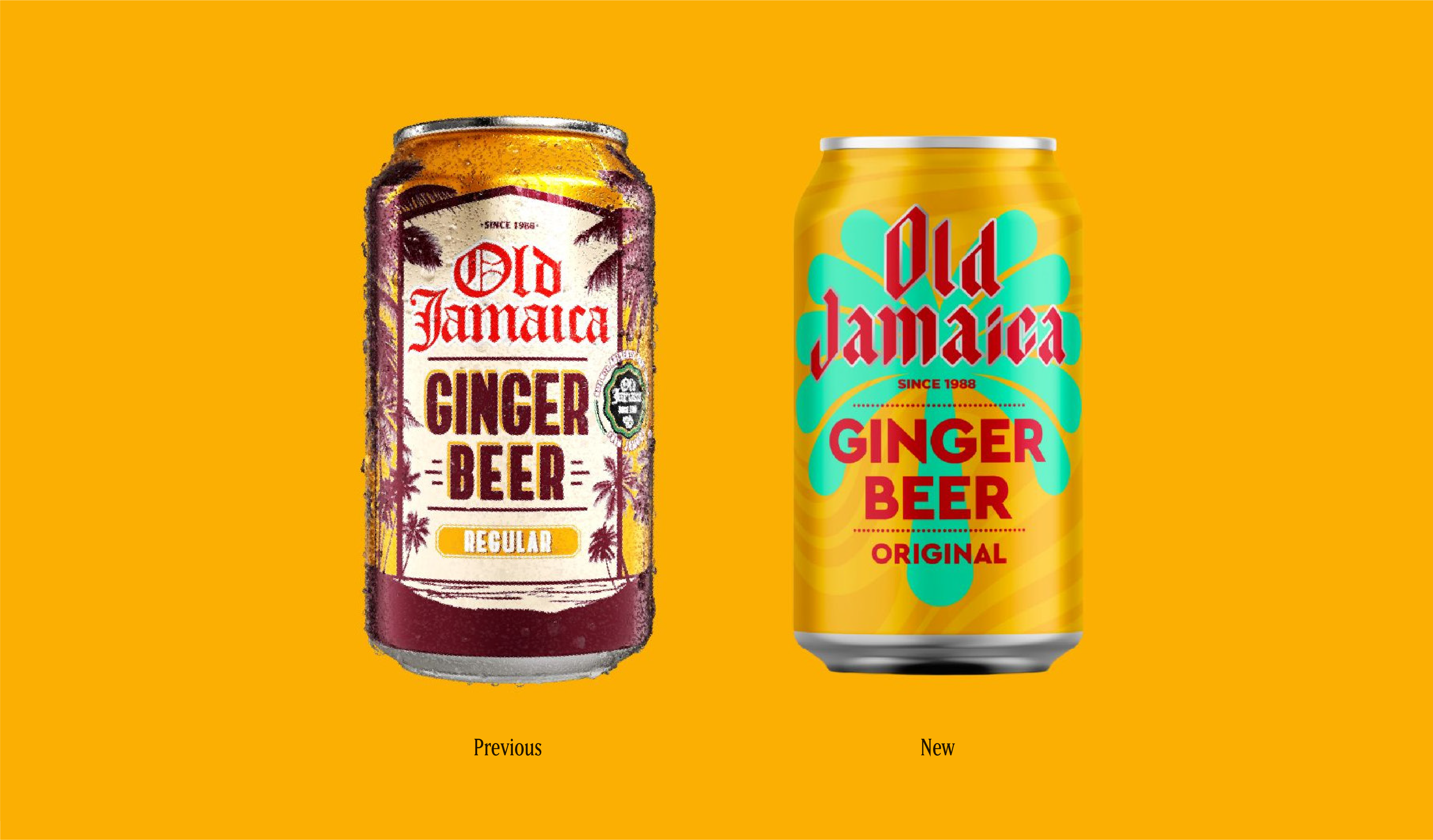
As we were melting away in the heatwave last summer, many of us might have been reaching for something cold and fizzy. Perhaps a crisp ginger beer?
Old Jamaica recently dropped a new look in preparation for summer 2025. And while I love a good rebrand (it’s a great chance to reflect the soul of a brand back to the world) this one made me pause. Why?
Because a rebrand should be rooted in truth, not trend. When your identity comes from something real, what you actually stand for, it resonates so much more. It builds loyalty. It drives sales and brand equity. And when it doesn’t? Well, people know.

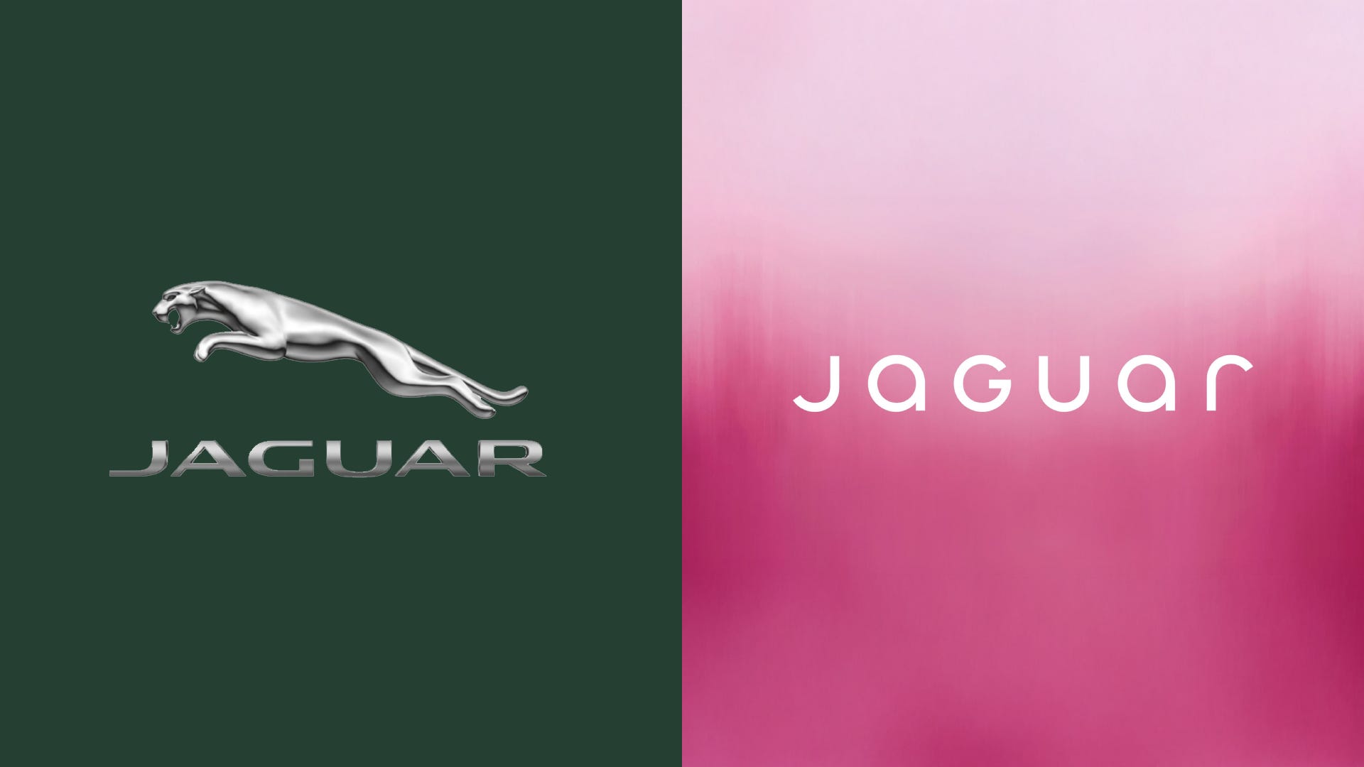
The latest, or shall I say canned, Jaguar rebrand is just another example. They went so far to modernise that they totally sidelined what Jaguar symbolised to their audience and therefore it landed badly. So badly, that they are going through another rebrand. European sales reportedly fell by 97.5% in April 2025, and global volumes dropped 85% from 2018 levels.
When you think about it, judging aesthetics is human instinct — whether it’s a person or a piece of packaging. We’re hard wired to sniff out the fake in order to make better choices, whether for survival or simply picking a fizzy drink.
So why does the Old Jamaica rebrand feel so off, and why are customers not happy? Through a brand lens, I’m going to break down why, and look at how brands can avoid falling into the “look cool now, fade later” trap.
1. Following trends isn’t a strategy.
Old Jamaica clearly wanted to freshen up, go bold, and appeal to a younger crowd especially in a saturated market of new indie drinks. Think: Trip, Dalston’s, Olipop, Karma Drinks, Something & Nothing, Real and my two personal faves; Steep Soda and Holos. I often choose one of these over anything alcoholic.
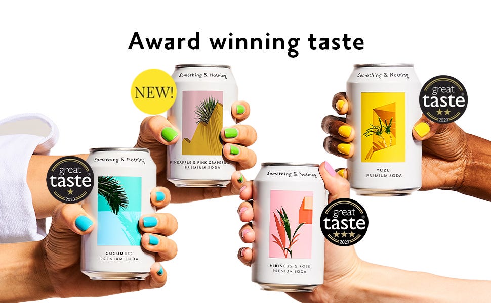
But here’s the thing, when everyone is doing bright and loud, you either have to do it better, or do something different, whether that’s a radical design or a compelling story.
Old Jamaica chose bold… but lost its identity along the way. The new look feels chaotic and clashy, like a supermarket own-brand trying to cosplay as ‘cool’. The previous version had charm. It didn’t feel cheap. Now it does.
You don’t need to be neon to get Gen Z’s attention. In fact, going the opposite way, authentic, grown-up, and stylish can stand out more.


2. Taste just... vanished.
FMCG 101: taste is king. Old Jamaica used to look tasty. That mix of reds, oranges, golds and creams, and palm trees, gave flavour. It transported you to the hot beaches and sunshine of actual Jamaica, and for some a Dark & Stormy cocktail…
or two. The old packaging told a story of spiced Jamaican ginger, warmth, and a sharp, nostalgic kick. As for the new packaging, well it doesn’t give my taste
buds anything.
3. You had a story, and dropped it.
The biggest thing for me is losing their story. The name is Old Jamaica, people expect a sense of wisdom, provenance, a romanticism that takes us away from grey Britain.
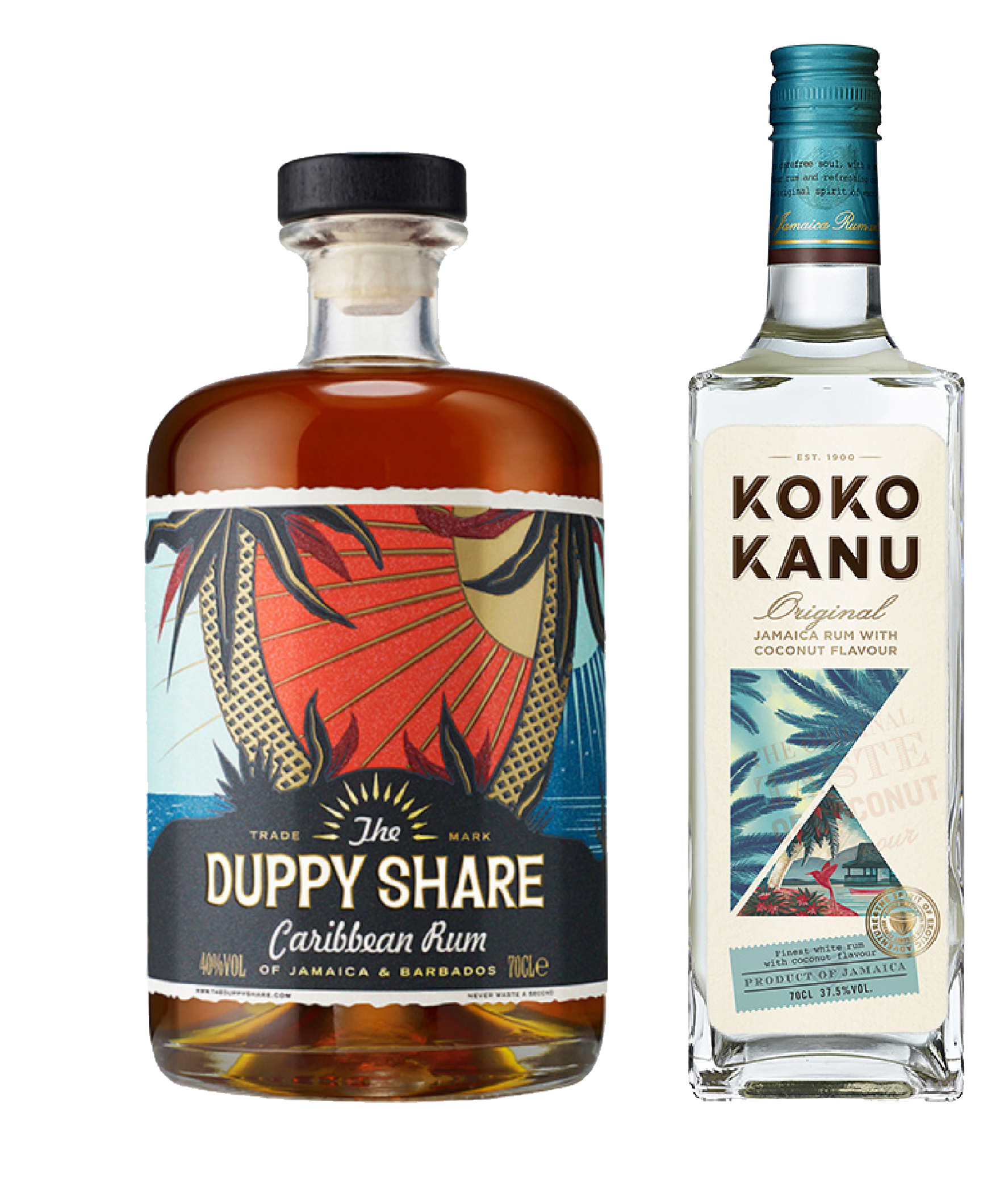
That doesn’t mean sticking with a dated look, but it does mean evolving tastefully. Look at brands like Duppy Share or Koko Kanu, they balance cultural storytelling–with modern design. You can respect heritage and still look modern and appetising.
Before the rebrand, the drink description references “the characteristic spiciness of Jamaican ginger” and “potent, flavourful roots.” Great. So why erase that in the visual identity? This is the UK. We’re obsessed with escapism.
Heat in a can? Yes, please. That’s what Old Jamaica used to offer. But the new look doesn’t give me any of that. In fact I get a confused flavour profile of pineapple juice caused by the clash of colour, icon and variant name visibility.
4. New vs Existing fans. You can have both.
There’s a balance to strike when refreshing a brand. It’s totally fine to move away from the expected if there’s a compelling reason to do so. Old Jamaica had a fan base. Many people grew up with it. And despite being a UK-born brand, it’s usually found in the “world food” aisle which on some levels signals a truer flavour experience.
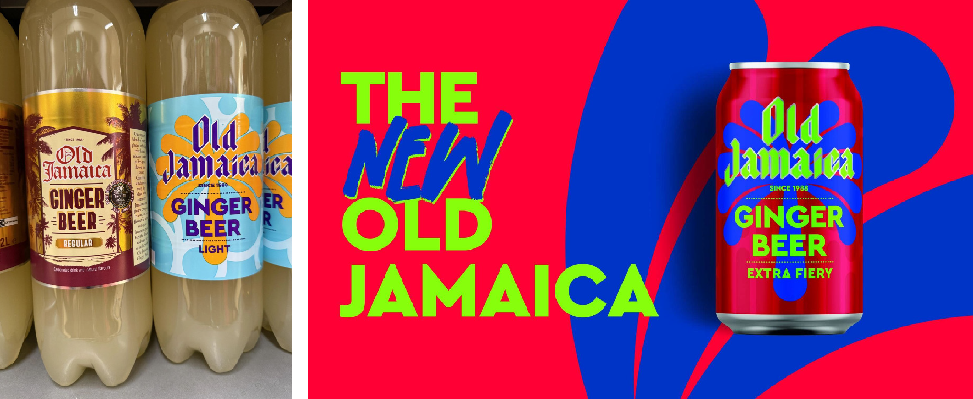
The old look needed a lift, and the brand clearly wanted to refresh to reconnect and drive sales. But in doing so, it sacrificed the sensory cues of taste, nostalgia, authenticity that the 80s brand was built on.
Sensory cues are powerful because they create deeper, emotional connections. The colours, shapes, textures, even fonts can trigger taste memories, cultural references, and feelings of comfort or excitement. When those cues are stripped away, you’re not just changing how the brand looks, you’re breaking the connection to how it feels.
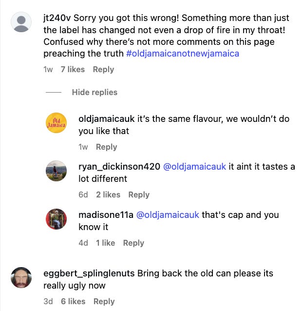
5. You can’t rebrand away from ingredients.
Now here’s the bigger issue, the actual drink. Packaging can only do so much if the product itself doesn’t meet today’s expectations. We’re in the age of “clean” drinks. Consumers are paying attention. Fewer additives, less sugar, better ingredients, these are no longer just nice-to-haves. Brands like Gingerella are already doing it brilliantly, using quality ingredients and setting the bar high, though often at a higher price point.


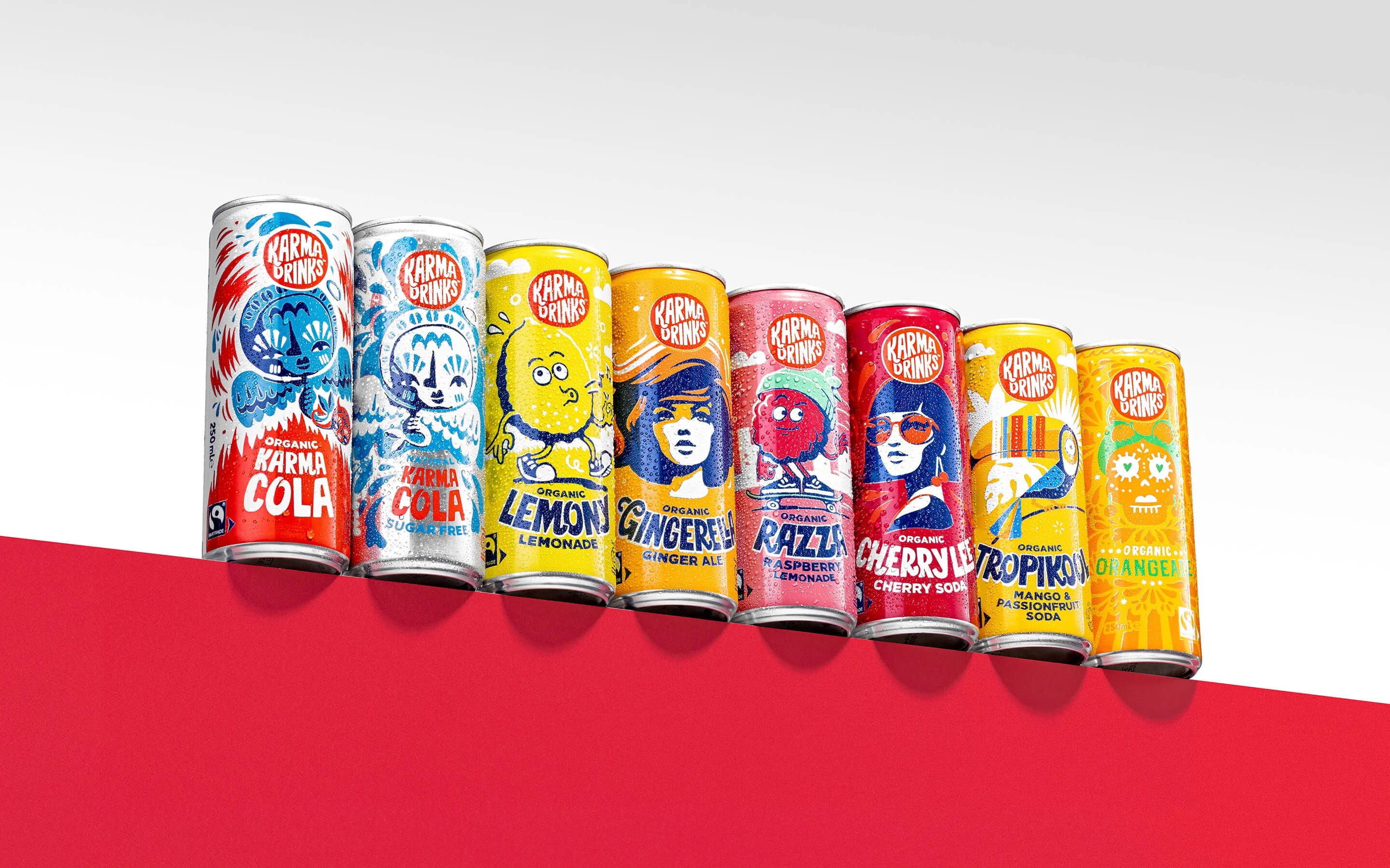
Old Jamaica is affordable, yes, its buyers may not be hardcore health-heads, but younger drinkers are cutting down on sugar. If the brand wants to futureproof itself, the product needs to evolve too.
So, what’s the truth?
This rebrand was a chance to lean into what makes Old Jamaica iconic—its flavour, provenance, and the memories it evokes.
A smarter approach could’ve captured that potent Jamaican spice and bottled heat, without going full primary school. The best rebrands aren’t surface-deep, they reflect the truth of the product and the promise it makes. And maybe this is their new reality. A cheap sugary drink for kids.
If I were on the brief, I’d dig into what makes this drink so craveable. What memories it stirs. I’d speak to real customers, new ginger beer fans and long-time loyalists alike. The authentic truth is always there. You just have to listen, and reflect on it.
That’s what builds legacy. That’s what stands out. And that’s how you win at a rebrand.