


When Bleiker’s Family Smokehouse came to us, they had built a reputation in Yorkshire for their craft, quality and innovation in smoking fish. However, their ambitions to grow had been limited by an outdated and unrelatable brand that had struggled to stand out in the smoked salmon category. Basically, they were invisible on shelf. They had all of this provenance and premium positioning but couldn’t stand out. They looked like every other brand in the space.
Step one: how to find out why your brand isn’t standing out
This is actually my favourite bit of FMCG projects: going into shops, standing in front of the shelves, naturally feeling where people’s eyes go. You’ve got about three seconds to win someone over at shelf. That’s it. Three seconds.
So where do our eyes go first?
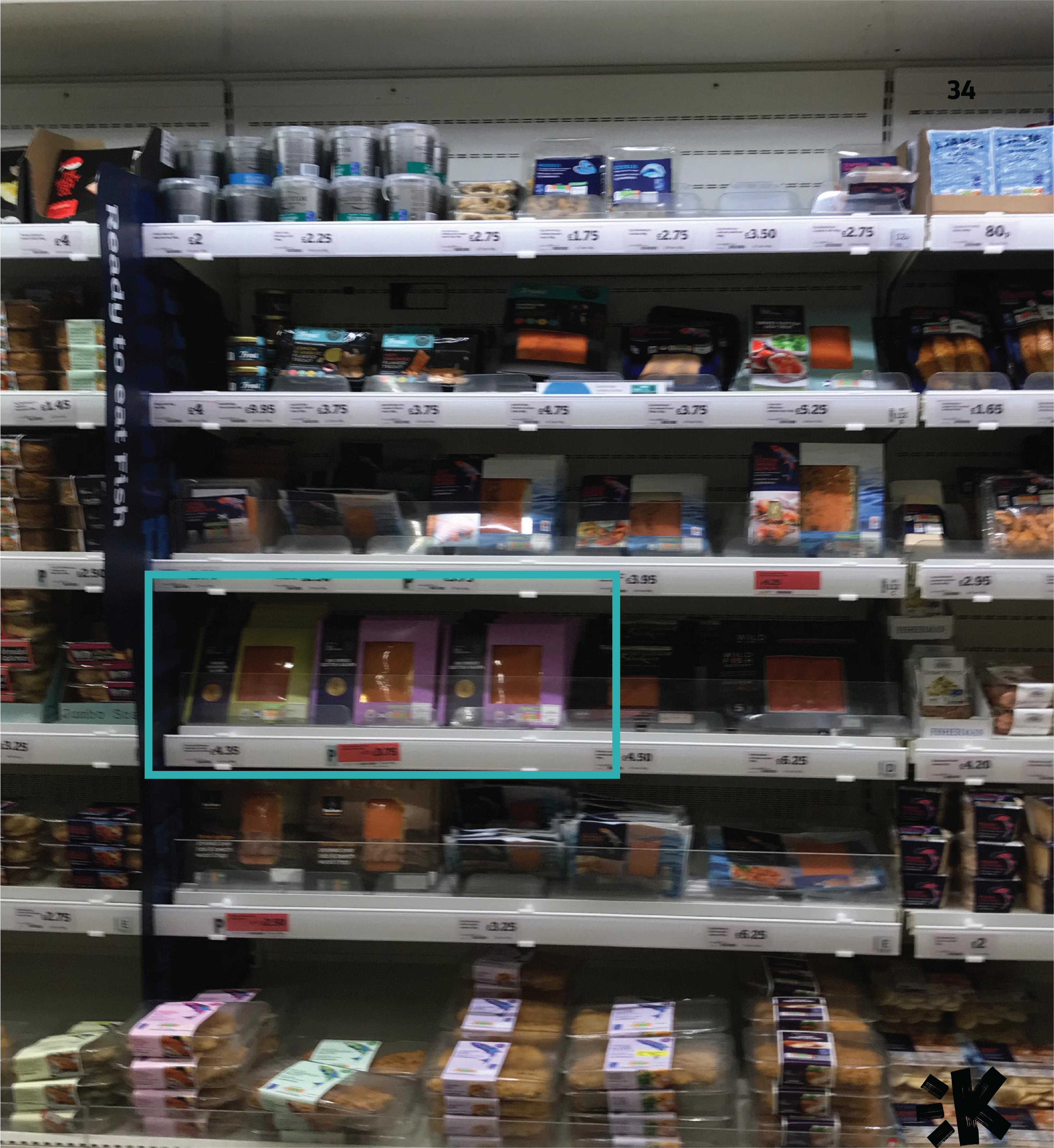
Straight to own label options.
Bleiker’s was completely lost on shelf. The overlapping shelves meant that anything not on the front row was lost in shadow. Putting dark packs at a disadvantage. The eye gets drawn to bright colour, pattern and simplicity, but also to any colour that’s different to the dominant fish category blue.
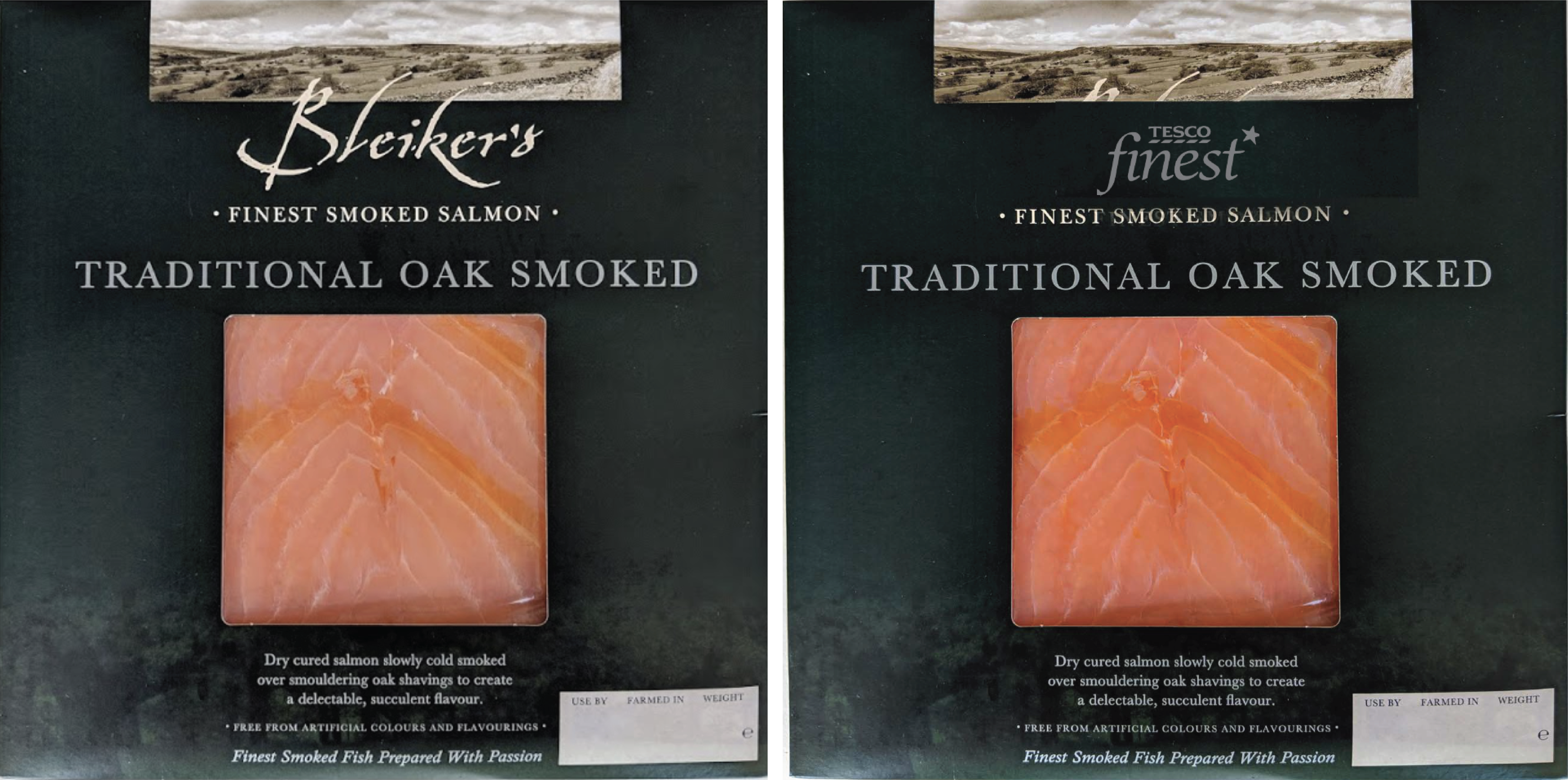
We also noticed that every “premium” cue Bleiker’s was using, like moody dark colours, serif fonts, wild landscapes, was also what every other brand was doing. We saw that the pack design could easily flip out to an own-brand label, and still feel completely at home. That was an issue.
Bleiker’s, which was arguably a better product, with more heritage, was losing to products with a fraction of its quality, because consumers literally could not tell the difference in the time they had.
Step two: Find where your culture has gone
Dig a bit deeper and there was a second problem: taste and culture had shifted.
We interviewed a range of younger people, with different backgrounds and eating habits and asked them what comes to mind when they think “smoked salmon.” The answers were strikingly consistent. “Posh white people with avocado on toast,” “Christmas, champagne, special occasion,” “affluent middle-aged professionals and 70-year-old ladies serving it as a canapé to their husband’s golfing friends.” Even people who loved eating it pictured someone else entirely when they thought about who it was for. “I think of wealthy retired women and a generic Scandinavian, I don’t picture myself, which is weird because I love eating smoked salmon.”
Not ideal.
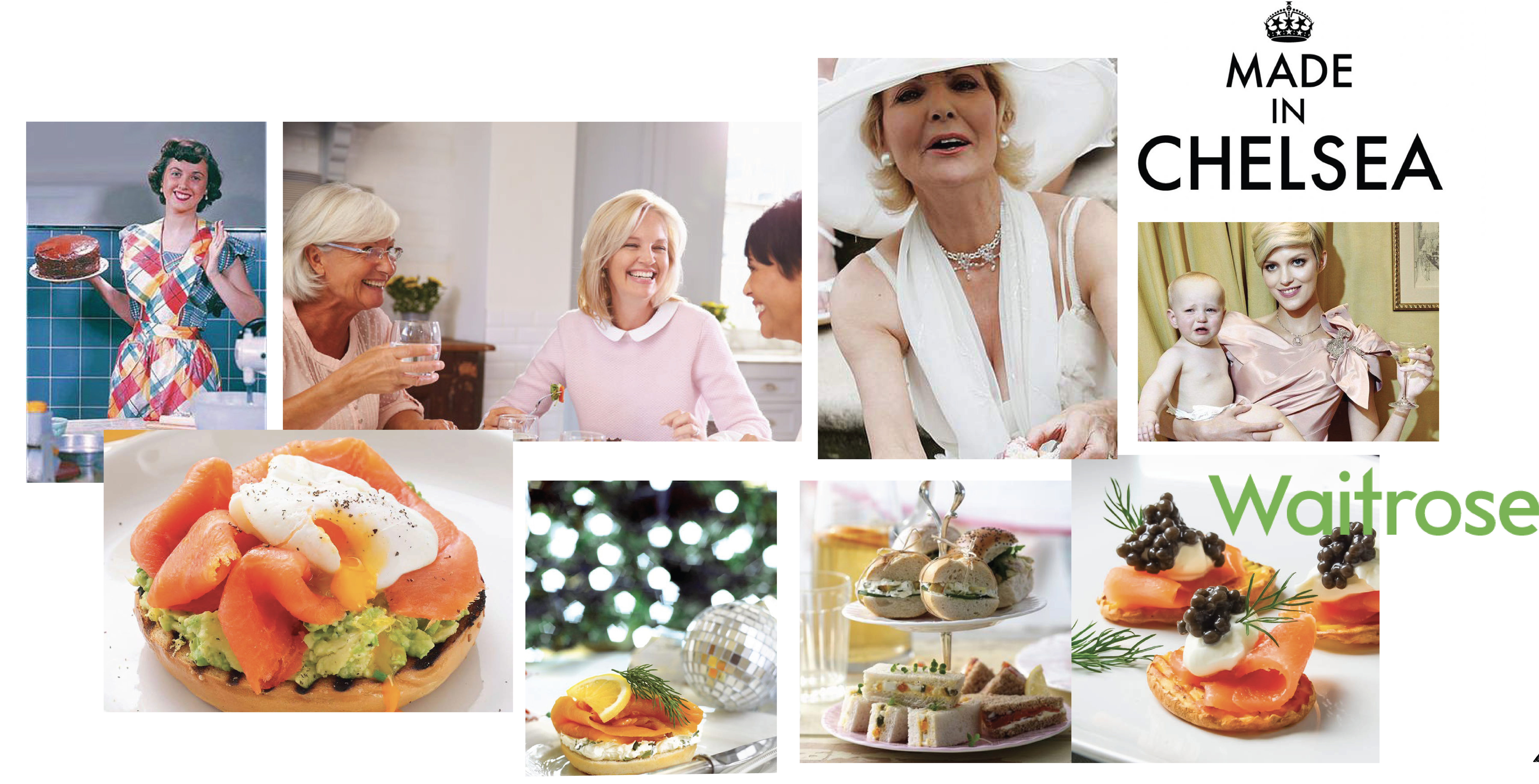
So we found a gap. The gap was between perception and where smoked salmon was actually living in culture. Smoked salmon as a food had moved on. Despite perception, it was no longer reserved for canapés or occasions. It was turning up on bagels, in scrambled eggs, in everyday brunches and elevated midweek dinners. Bleiker’s labels were still communicating like it was still 1998 and you only eat this stuff with a side of silver service, so they were stuck selling to a customer who was ageing out, while the actual consumer gap was happening in the world of sexier, brighter, younger “treat-yourself” demographics.
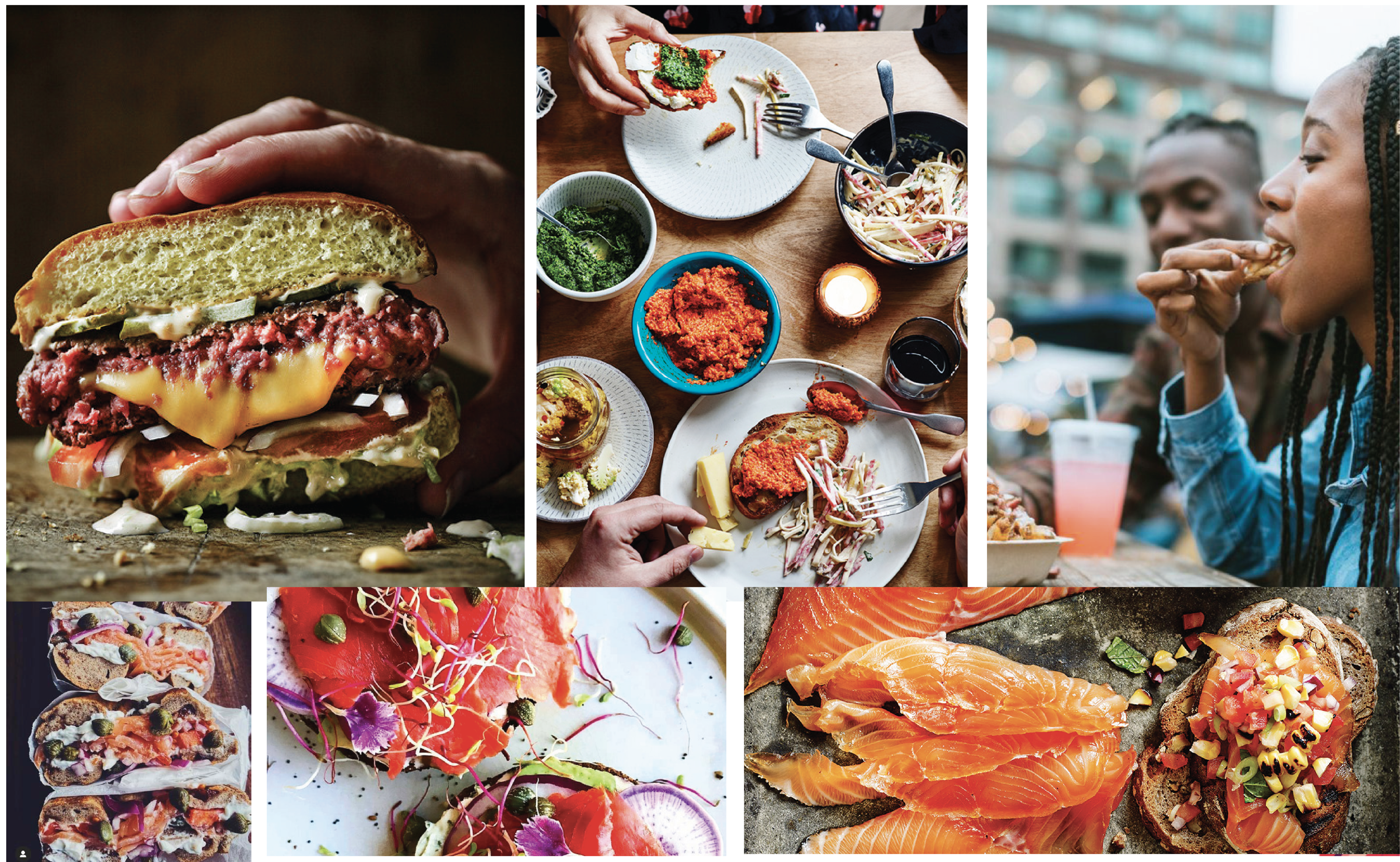
Instead of trying to chase that niche older ultra-premium demographic, we zoomed out to a mindset. We called them Experience Elevators: people who take a normal moment (breakfast, a get-together, a random Tuesday) and make it slightly more special. Could be 24, could be 64, they just wanted to make something a little bit nicer.
We wanted to invite this younger generation in with something insta-worthy. To do that we knew they needed to:
Lead with taste, make people’s mouths water before anything else
Keep the healthy choice as a nice bonus
Inspire actual usage, recipes, combos, ideas, not just “serve on a blini”
Step three: Find the Soul
We ran our Brand Spark process to nail down the soul of the brand.
The Home of Smokecraft
This new soul emphasised the process and transformation that happens to the fish in the smokehouse itself, a radically different approach to the typical seascape and provenance-orientated cues in the category.
Soul: Bleiker’s creative ‘smoke-craft’ approach to smoked salmon opens up a world of complex, exciting and thrilling sensations
Purpose: The mighty salmon, a superfood superstar. Long overlooked, we’re putting it back in the limelight by showing the world how amazing it can truly be when it’s hand-cured, hand-smoked; made at its best.
Vision: Hog roast is over it, beef’s had its day, chicken’s basically done. Smoked salmon is the new main character of the feast.
Personality: Quirky, generous, a craftsman, and bold food lover
Values: Salmon, our superfood hero, created with family and community, and handcrafted without compromise. All moments can be divine with smoked salmon. Smoking is an art, not a science. We care for our people, it’s those that make it all possible.
We also did a Fuck-It List (one of my favourite exercises) to find everything that Bleiker’s stood against. Their fuck it’s were: salmon as an afterthought food, losing the family values that built the business, pretending to be experts, cutting corners on quality, bad culture, generally taking itself too seriously.
All of this work led to the visuals of the rebrand, leading the brand away from the moody, landscape-led, silver-foiled clichés of the category and towards something that actually stood out on shelf and felt true to their identity. The smokehouse itself became the central design device, a bold, smokehouse-shaped architecture on pack, bellowing out the flavour inside. By using the fish as cutouts, we broke up the square format every other brand in the category was using. We kept the handcrafted style of the logo but added a bit of panache.
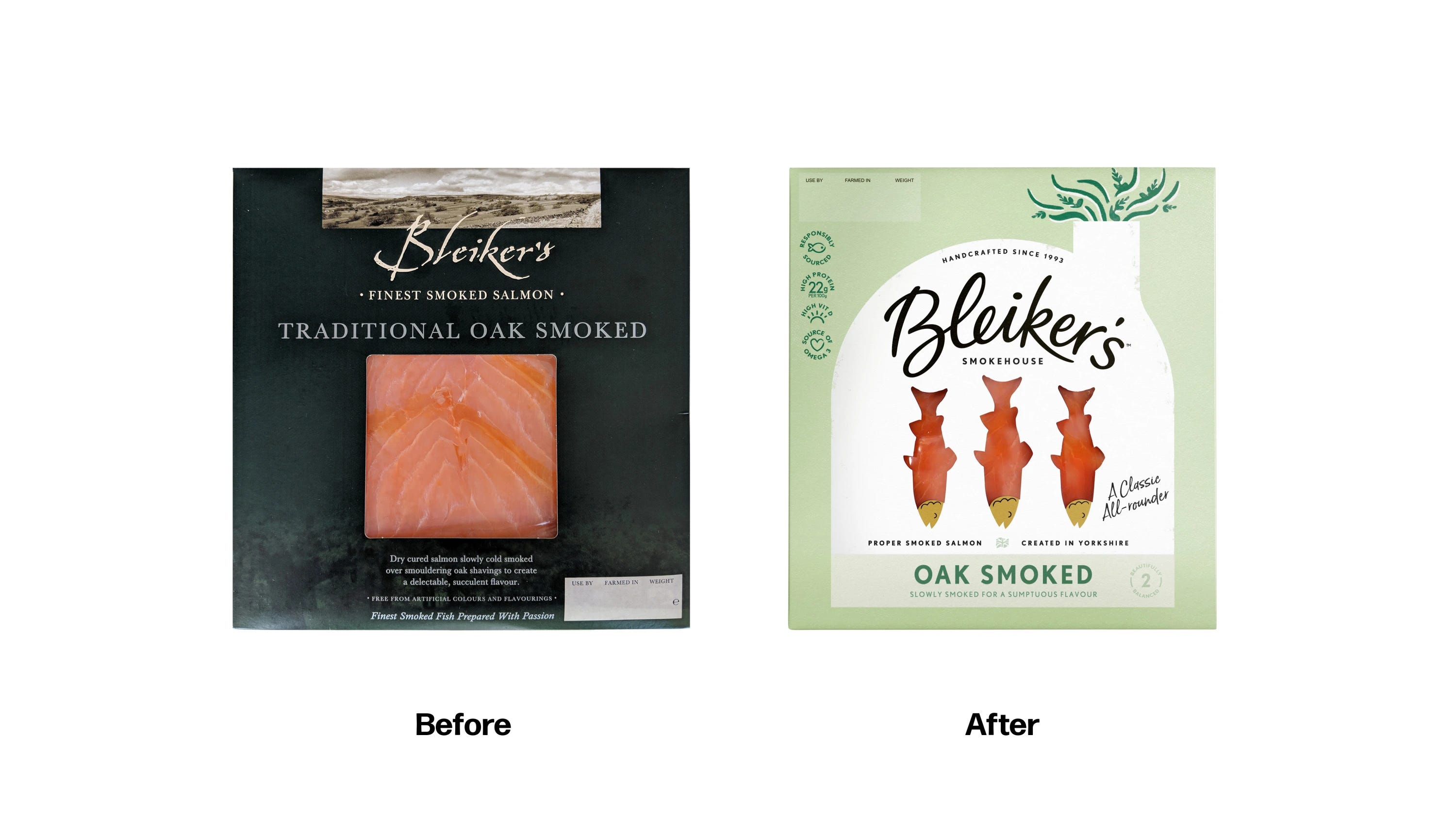
Across the wider range- flakes, mackerel, and a growing list of new flavours- the smokehouse architecture flexed to fit different formats, giving Bleiker's a flexible, future-proof set of assets it could keep building on as the range grew.
Did it work?
They had a 30% growth in like-for-like sales on existing lines post-launch. Listings went from 60 regional stores to 260+ nationwide, including a big rollout with Morrisons, plus new multi-SKU listings across other major retailers. ROI was reached within 4 months, and new seasonal listing opportunities were won across major supermarkets for innovation SKUs. Bleiker’s has become a recognisable brand in the category.
If your product looks like everything else in the category, even if yours is objectively better, you’re invisible. Full stop. Doesn’t matter how good it is if nobody can clock it in three seconds.
“More premium” wasn’t the answer. Premium had become the most crowded, most identical space in the entire category, everyone shouting the same thing, louder. The answer was both looking at the culture and that space that had shifted, and what no one else was doing.